Inspiration Boards

My first tutorial was helpful in regards to discussing how to develop my photographs further. Drawing exercises were suggested to experiment with different drawing styles. I was set the task of finding a new drawing style before the next week.
I decided to create mood boards to visualise the research I'd completed, keeping myself inspired. Being a visual person, images are very useful to me. Below are examples of Ella Doran’s work, a designer I completed work experience with over the summer. She translates photographic images into repeat patterns. Her images are of everyday things such as Bikes of Hackney, which is where she lives, and the Letterpress pattern inspired by a letterpress in her studio. I thought this was an interesting way of working and it was after this that I decided to document what I saw through photography.   
Another artist that I have researched is Tilleke Schwarz whose main context of work is embroidery. Her process consists of embroidering what she's thinking at that time, which is an interesting process because passing thoughts are quick but completing embroidery is a slow process. I find that her style of work is similar to the graffiti I have seen because it consists of a lot of overlapping random imagery.
I have researched two new artists that I wish to bring to next week's tutorial and that is the work of Harriet Popham, who's work consists of watercolours and illustrative quality. I think that her combinations between foreground and background are very interesting because she presents them in different styles of drawing, eg The circular image below consists of a water coloured background and black and while illustrative detail over the top, playing with background and foreground effects adding more depth to a piece. She also creates designs for interiors, such as wallpaper. 

The other artist I wish to discuss is Abigail Ahern. She incorporates graffiti in the backgrounds of her painting and also designs wall paper of a photographic quality, which is very much like Ella Doran. She photographs walls and rustic tiles, taking into account the range of textured surfaces and uses them to create repeat patterns. I found it interesting how Abigail Ahern reflected the different textures through the patchwork dog cushion covers, enabling me to see how one pattern can influence another in order to create a collection.

From researching these artists I have come to understand that I am interested in foreground and background combinations, and creating visuals from the everyday. Another aspect I like about the work is the busy appearance and use of repeat patterns. I wrote in my learning agreement that my original inspiration was from graffiti and I have come to understand that I was interested in the same concept of foreground and background combinations. Regarding Graffiti, there can be a wide range of text and imagery that is joined together by the brick pattern in the wall underneath.


Abigail Ahern's wallpaper in centre

Learning Agreement

Project statement (aims & outline)
  • To create a body of work that is suitable for interiors.
  • Use and develop embroidery techniques by experimenting with the ETHOS.
  • Experiment with translating drawings and collages onto fabric by using print and stitch techniques.
  • To work with fabrics suitable for interior.
  • To experiment with use of motifs and colour to create different designs for different age groups.
My inspiration has come travelling around over the summer. I took my camera and documented what I saw. I want my project to be personal to me by including things I have seen and I aim to create a series of motifs from the images I have taken. I will firstly experiment on paper by drawing and painting, I then plan to take these designs onto fabric by using a range of embroidery and print techniques.
In past projects I have tried to make my work appear fun and playful, however sometimes the outcomes appears to be more for children than adults. I will use this project as an opportunity to experiment with colour and motifs, creating different combinations that will be suitable for older and younger age groups. By harnessing my ability to create fun designs, I feel that it will benefit my practice to experiment where they will fit in the market 


----------------------------------------------------------- 


Boards completed over Summer 


new designers report

I have created a report on three students who exhibited at New Designers 2014 as I was unable to attend the degree show, due to undertaking work experience with Ella Doran. 

ALISHA FALLON 


PROJECT DESCRIPTION

A Nation of Shopkeepers
Tin openers, Kettles and Toothbrushes, these seemingly mundane objects don’t scream the
basis for a textile design project, but why not? The complexity of modern life overshadows
everyday commodities such as these but can’t things just be simple? A Nation of
Shopkeepers derives from an interest in daily life, concentrating on the monotonous objects
we’re surrounded by. Illustrated in a bold and vibrant way, creating juxtaposition with reality.

Alisha Fallon’s space featured a wide range of prints and weave samples. It was interesting seeing the designs presented in two mediums as this added more depth to the pieces. Her work consisted of all over repeat patterns, derived from everyday objects. I think that the composition of the designs work well because the area around each motif is filled with a textured quality.


JING ZHOU 


Jing Zhou has created a range of embroidery samples by using digital embroidery, layering and stitching leather shapes onto fabric. Below her fabric samples are her initial designs, made from paper. It was interesting to see her thought process through developing her designs from paper onto fabric. She has concentrated on repetitive forms to create her samples and by layering the pieces of leather she has created a range of interesting surfaces and textural patterns.
She presented an effective colour palette; consisting of soft pastel colours with
a mixture of black, white and grey. The pastel colours stood out as they looked bold, but not garish against the black and white.
I really like the use of block colour with the digital embroidery machine because it doesn’t
warp the fabric and Jing Zhou has used this setting to stitch a variety of patterns where the
shapes are interlocking. I like this effect because the stitching created a slightly raised area
and as some of the black fabric from underneath was visible through the gaps in between the
shapes, it created a subtle 3D effect. 

FRANKIE BLAIR

Frankie Blair’s print designs have been inspired by architecture around Europe. Her space featured a wide variety of prints for fashion, and she has also created a selection of male shirts and T-shirts with her designs.I thought that her work was displayed in a professional way, and it was clear where her inspiration had come from.
She has created a wide range of prints, most of which featuring windows. I think that the reflection of the sky in the windows is really interesting, and I also like the layered buildings because they include a lot of architectural detail.


meetings before easter

As we are breaking up for Easter, we have decided to meet up as much as possible this week.
We are now narrowing down our thoughts to what we think are going to be the key elements of this project.
Recurring themes:

Noticing the Unnoticed
Weeds, specifically dandelions, we like the idea of this being the logo
Guerilla Gardening / Colour our city
Small changes going towards one greater change - reflects the seeds of a one-o'clock - individually they are small, but together they create one larger thing.
Collaboration - creative and conceptual people pairing up and working together
Work shops - recycling- idea with plastic bottles
Changing the idea of a design festival- does it only have to last a week?
Changing people's perspectives of the city - idea for another workshop with view finders, which will make people look at the city in a different way

I have enjoyed the group meeting because it seems a lot less formal than a tutorial, and I feel more comfortable voicing my opinions. At the moment I feel that we are being a bit repetitive as a group, as we are meeting up, and talking about what was previously discussed in the previous meeting. I also think that the ideas we are having are really conceptual, which is great because there will be a story behind out work.
One of the girls from interactive arts mentioned the idea of the logo being a sticker, that could be placed around the City, to reflect that change is here to stay and the festival doesn't just last a week, but then of the other girls then said that if we were doing something like this it could be seen as vandalism.
I think the idea had a great concept, possibly not that realistic as we would be pitching to the council at the end, and I'm not too sure they would be keen on stickers around the city. The idea introduced a different way of advertising the festival that I definitely wouldn't have thought of on my own.
This has got me thinking of different shapes, so a sticker might not be realistic, but we could have the posters in a circular shape so that they differentiate from other posters.


3D printing

We had a session concerning 3D printing because this seemed to be something that kept popping up at recent design festivals.
3D printing still seems really new to me because I haven't heard that much about it.

My notes:

-3D printing is coming to the end of it's patentee
-no assembly is required, the object can be used after printing with no hassle
-infinite shapes of material
-it can be used to make 3D portraits, such as dolls based on real people

-Wide variety of materials can be used to print with such as metal, plastic and human cells

-someone invented a 3D printed gun, which had no parts to assemble

-Iris Van Herpen designed a 3D printed dress

- you can get a 3D printer for your home / desktop 3D printer
-the 3D printing process is quite slow at the moment, as things take a while to print out

We then discussed some of the issues surrounding some of the objects that have been printed.
The one that seemed most controversial was the 3D printed heart valve, and other body parts printed out of cells.
This opened up a lot of issues such as :
is it okay to prolong life?
is it natural?
are humans playing god?
will anyone ever die if we keep fixing ourselves?
It's a difficult topic to discuss because there is no right or wrong answer, and printing organs is just a bit too much for me to take in. 

Another interesting topic was the 3D printed gun.
Quite a few people had an issue with the blue prints being posted on the internet because it meant that people could access them and end up printing their own gun, with no licence.

Meat can be 3D printed aswell. I thought this was weird.
I had wondered if Jewish people could eat 3D printed 'pork', because it's never been an animal.
Would it be classed as Halal?

Is 3D printing green?

The program allows users to work out the optimum shape of an object based on its maximum strength and minimum amount of material used

any waste metal can be reused, but the designs are created through trial and error, so you land up creating a lot of wasted products, meaning that the design process is less precious.

Talking about the waste problems of 3D printing lead onto talking about the North Atlantic Garbage patch, as a lot of the objects created by 3D printing are made of plastic, they are likely to end up here.

I was really interested to find out that there are such thing as artificial microbial reefs that survive by eating the plastic. It's amazing that because of plastic, new life forms have evolved, and it is now an important part of the oceanic ecosystem.

Realistically, I don't see myself using 3D printing in this project because it is just too expensive at uni. I also think it takes the process of making away a little bit because everything is done on a computer.


Group Meeting

We decided to meet as a group before our next tutorial.
The aim was to discuss themes that we were attracted to, in order to find common ground that we can develop the design festival from.
In the previous tutorial we had discussed transport, which had sparked conversation about cycling, and encouraging people to be Eco-friendly, and nature had been a prominent factor in our discussion.

We discussed what a design festival actually is, and whether or not we can change the visitors expectation of the design festival.
We really liked the idea of carrying the design festival on, so that it wasn't just one event, but you can keep adding to it after wards.
We thought this could be possible through social media and by holding competitions, etc.
By having an online presence we also thought that this would allow people to know what was happening at the event, even if they couldn't make it.
We also thought that this would be a good way for visitors to interact with the design festival, as they could take photos of themselves participating and add them to an online collage of contributions.

We then went onto discuss how we can make the design festival personal to the visitors.
The idea of tickets to the event was an interesting topic as, as some people in the group said they would be happy with a virtual ticket, whilst others said that they like the idea of having something that they can hold. A real ticket can also be used as memorabilia of the design festival. 

We liked the idea of creating something small that visitors can take home with them like a pet plant or a small visitors pack.

We liked the concept of small changes going towards a big change

Nature was again a prominent theme in the discussion.
We talked about how there is a lack of greenery in the city, and how it is ironic that people dig out weeds from an urban environment but don't replace them with anything else.
We said they they might as well keep the weeds, so that at least something is growing.
We also talked about the weeds being relentless and growing in bizarre places.

Noticing the unnoticed :) 

Where the event would take place was also on everyone's mind.
There are a lot of places in Manchester that are unused, where buildings have been knocked down and nothing erected in its place.
We decided that we would go out and photograph these places, to get more of an idea of what was realistically possible, and also to start noticing the unnoticed around Manchester.

I decided to do this on my own, because I thought that if the group went out together then it would take a lot longer, than if we went out separately or in smaller groups. I also thought that I might notice something different to what others noticed and vice versa.


There is a patch of land on Whitworth street that looks very abandoned. There are weeds growing amongst the cracks in the cement, and there are no immediate plans for the land to be developed. I thought that this would be a good area to host part of the event, as it it close to parking and access to it is easy. Being close to the city centre makes it quite appealing and it is a large area of land.


We had also been discussing car parks, and how they are everywhere. Buildings are knocked down and parks are replaced for car parks.
I thought of the idea of having the design festival, or part of it, in a car park. I'm not too sure how viable the idea would be, as it would be taking up space people need to park in in order to visit the festival. This could be a catch twenty two situation.


They are all over the place though!


With this car park, I thought it was interesting that there are trees surrounding it. This then got me noticing how green Manchester actually is. Considering it is a very built up area, there seems to be greenery almost everywhere you look.


mini garden


The idea of part of the design festival actually inside unused buildings would be quite interesting, because it would show that these buildings can be used for something, instead of being left to rot.


At this stage I think it's important to remember that we are pitching to the council at the end of the project, and I don't think they would be very happy if we said that they weren't doing a good job with making Manchester green, because they are.
I feel that I have become a victim of my own prejudice. I have assumed that because Manchester is a city, there isn't going to be a lot of greenery in it. Since taking these photos I am noticing greenery everywhere. There are trees along pavements, mini gardens on the edge of buildings, numerous pot plants, etc. I think that it would be a good to develop the concept of changing peoples negative connotations of Manchester, and get people noticing all the great parts of it.


manifesto mindboggle, briefing and the start of unit X

'what is a manifesto?'

  • defining your practice 
  • formal intension
  • ground rules
  • statement of intent 
  • political declaration 
  • belief/policies you stand for 


We had the opportunity to read through a few examples of manifestos written by artists, designers and political parties before discussing what a manifesto is and then writing our own.
The layout of the manifestos varied, and I noticed that everyone's was completely different.
In the sub group I was in, we decided to write our manifesto as a recipe to make it seem more light hearted and fun.

why are artists interested in manifestos?
In the early 20th century, many artists were interested in politics, and this was reflected in their work.
Their work was used as propaganda or reflected what was happening at the time

The futurists were the first movement to use manifestos, and after this all artists had to have one in order to voice their ideas.

I think that being able to write a manifesto will be useful when we start planning the design festival, because we will be able to clearly state our proposal, and it will also provide us with some ground rules that we can stick to as a group.


Example of an existing manifesto

planning our manifesto

Our manifesto for writing a manifesto

Choosing the biref
we were given the choice of two briefs to choose from; the first was working with Manchester Art Gallery in order to come up with an idea for a work shop that engages the general public and the second was to create an imaginary design festival that would take part in Manchester.
I chose the latter.

Brief
'This project option will consider ideas for a future festival of design to take place in Manchester. You will work in small groups in response to the project brief which asks you to focus on process rather than product. The project is deliberately open as you will be generating the content rather than responding to a set brief. Our project partners are looking for imaginative responses that explore what format(s) the festival might take, where it could be situated in the city (if indeed it needs to be situated in a physical space), its possible venues, branding and marketing etc.
College 3 - Blue Sky Thinking - is about the possible rather than pre-existing formats, it asks you to speculate, to push boundaries and to test ideas through a variety of different media and materials. It is about ideas in a state of flux that might find temporary expression in proposals, models and maquettes, performances, films, zines, posters, banners, pamphlets, speeches, debates, events … You are therefore encouraged to think of design as a process involved in problem solving and communication rather than thinking in terms of commercial Ê»endʼ products.
Building on the opening two weeks of Unit X where you have explored collective concerns through the un-conference and used the manifesto as a creative tool for the expression and communication of ideas, you will now identify key themes that enable you to form small groups with other students from across disciplinary areas. Working with your manifestos as a starting point you will develop themes.'


what is a design festival?

To start off this project, we were shown a few examples of design festivals and what they entail.
I found these talks really helpful, as I have never been to a design festival before the whole concept seems rather daunting. 

Stockholm Design Festival 

-Turned into a design week that has run for over 10 years as an umbrella event for the furniture and light fair 
-Guest of honour for 2014 was Gam Fratesi who created sculptured based on the idea of finding balance, which was a recurring theme through out the design festival. 
-Guest of honour for 2013 was Nendo who created the 80 Sheets of Mountains instillation in order to express the way design expands whilst minimising the environmental impact as the instillation could be recycled afterwards. 
- Another instillation in 2013, created by Anatomy of Communication, consisted of loads of sheets of paper presented in such a way that when you were stood underneath, you could see an interesting pattern. This instillation was displayed in an area of the festival where talks would take place. 
-There is an area within the show called Greenhouse, where new talent can display their work relating to furniture or lights. The applicants can't be associated to any particular manufacturer and the products can't have been exhibited before.

Through out this talk I noticed that the design festival involved a lot of instillations with interesting concepts. The presentation of the furniture also resembled that of instillations, which I thought was really interesting but also quite obvious as the designers have put a lot of effort into creating their furniture so they would want to present it in the most memorable way, which will also compliment their work.


Milan Design Festival 

-Takes place outside the city centre
-The trade fair includes contemporary displays of products
-Environments are created in order to showcase the work
-Emphasis on the type of companies that display their work there
   ( Moroso, Dedon, Kusch & Co)
-Tom Dixon from the Museum of Science and Technology showcased his project called Designer's Block, where he let people who attended the design festival create their own lampshade by the use of 3D printing.
- Alvaro Catalan De Ocon's PET Lamps were a really interesting concept. They were inspired by looking at plastic waste in the Amazon. They are created by recycling the plastic by weaving it to create lamps.
-Studio Swine's Sea Chair project was featured at the design festival. They built a machine to collect plastic waste from the sea.
-La Rinascente (an upmarket department store) was hacked in 2012. A studio space was built inside the store, combing the hacker and maker community. The intention was to allow making to change things socially.
-There was a lot of emphasis on the process of a project and not just the outcome. This allows people to engage with the project and understand the intention behind it.

Recent trends of the design festival 
- discussion
-inside/outside environments
-non European designs
-socially engaged designs
-materials and waste
-3D printing
-open source


We were also given a talk about some of the instillations featured at London design festival, and I was really interested in the event, I researched into it a bit more so that I could gain a better understanding of what is featured at the design festival. I wanted to fully grasp the concept of a design festival before we have to start thinking about creating out own.


Common themes of a design festival:
-interactive work
-recycling
-representing nature in an alternative way
-rescuing nature
-problem solving
-over all colour pallet represented through posters, website, flyers & map
- specific locations chosen to represent different events
-local artists, designers and shops take part
-sponsors
- collaboration


Unit X Lectures by artists

At the beginning of unit X we were given the opportunity to hear artists talk about their work. I really enjoyed being able to hear people speak about their work last year, so I was eager to attend as many talks as possible.

Suzie Mac Murray was really interesting to listen to. I thought that she was completely right when she said that its good to experiment with a lot of stuff, so you can allow yourself to be wasteful. A lot of her creations consisted of repetitive forms, such as her balloon dress and her mussels and velvet
-she is interested in the juxtaposition of things being solid and delicate, this was represented in staircase. Her work also represents something that has already happened, that I thought that having a great concept makes her pieces a lot more interesting.her balloon instillation called Spawn. The balloons look solid because they are filled with water, but if you prick them then they would disappear.

-she highlighted some barriers she had to deal with, such as putting her work into public spaces. She created an instillation using a lot of feathers and she had to make sure that the feathers were fire proof, and the stuff the feathers were put into.

I attended the Sandwich Work Shop...again. I enjoyed it last year and I enjoyed it this time round too! The idea of making friends around food was really great, and it was nice to talk to people from outside of textiles in practice.

Brendan Dawes was a joy to listen to. He had a positive attitude that reflected into his work and I thought that his Happiness Machine was a fantastic invention; the machine was connected to twitter, and every time the button was pressed, it would print out something that someone had posted on twitter that had the word 'happy' in it. This meant that each slip printed is different, making it individual to its owner.
He is really interested in social media, and some of his work directly reflects what is happening/ has happened on twitter. He introduced a new way of thinking to me, as I would have never thought of combining social media websites and art. He also gave some great advice like "own your differences" and "people want different things, you can't meet everyone's needs".


evaluation

I have really enjoyed this project. Ive been able to be really creative with my sampling, and I have also managed to get to grips with photoshop. I feel that I have stuck to my brief and I think I have managed my time well and consistantly through out this project.
My origional aim was to 'create a range of experimental designs for interior surfaces or products by using an object that is broken', I landed up taking  apart a broken television, and created a series of patterns that can be used across a series of interior and designs for products. In order for my patterns to be versitile amoungst interior products, I had to use a range of different techniques, involving digital and machine, so that the patterns would look presentable on fabric and on a solid surface.
Overall I am really happy with the work I've produced this term.
I regret not being as productive in the first two weeks of the project as I feel that I was slightly isconnected, as I had a bit of trouble writing my brief, however I managed to make up the time in the end. For my next project I want to try and be more reflective, as I feel I havent fully demonstrated what my thoughts and feelings were properly during this one.

putting my work into context


I have used photoshop to put my work into context by scanning it in, and manipulating the layers to edit it over an origional image. I think my designs have been quite successful. They would work well as interior and product patterns. I havent uploaded all of my context images on here because I've already presented them in my folder.
I have been selective when choosing which print to use for what surface. I tried using one of my fabric samples as wallpaper but, obviously, it didnt look right. Ive used my lighter coloured designs on the lamps because they are more of a realistic option.


Tiger Print Competition

I combined my live brief and my self directed project together. This made sence because the tiger print project involved creating an everyday surface pattern aswell.
I was put into the short-list for the competition, which is a result im really happy with.
 
The aim of the Everyday Surface Pattern Brief was to design a contemporary surface pattern for a male or female recipient that could be used across a range of our everyday products including
gift bags, wrapping paper, stationery products or greeting cards. It asked you to focus on a theme and it gave some examples such as spots, stripes, male icons or female icons, but I decided to focus on electrical components and circuit boards because it related to my self directed project. I have used the circuit boards found in an old television that I took apart and my colour scheme is taken from the components found in there aswell. My intensions for these prints was for stationary, and overall I am happy with their appearance.
My aim wasn't to create a collection, as that wasn't what the brief asked you to do, but to create three completely different prints that origionated from the same source.

Market research

I thought it would be a good idea to research the rooms and products that my designs are intended for. I didn't want to restrict myself at the beginning of the project for who my target audience was going to be, but as my motifs have been developing, it is very clear that they are more suited for children. I could see my designs used for interiors or on products such as for stationary.
 

 All images are from Easy Living magazine. They display a huge variety of ideas for children's rooms which include a range of furniture from different supliers.


combining samples

Some of my digital samples didn't turn out exactly how I wanted them to and some of my soldered samples didn't turn out that brilliantly either, so I decided to combine the two.
I think I have created an interesting technique because you can just see the digital print where the motifs are. Ideally, I should have made the motifs bigger, so that you could see more of the digital print, but as a subtle effect, I think it works well.
They're better than they were before anyway!


More Faric Samples

I really enjoy fabric sampling because I allows me to be really creative. This time though, I have firmly stuck to my colour pallet because I want my samples to be able to make up a collection at the end of this project.
I am actually pleased with all of my samples, The only thing I wish I'd done differently is that I wish I'd made more!

Embellished cotton outlined by free machining 


Embellished carpet underlay outlined with free machining technique
I decided to experiment with carpet underlay because I noticed that it included most of the colours from my colour pallet. I think it creates a unique effect that works well


I really like this suede fabric. I've created the motifs by using the free machining technique 


Carpet underlay with a multi-head stitch-out on top. I think this works well. I think I should have put more motifs on it though because the underlay is a bit too busy. I think more of the white motifs would have given it more of a tamer feel.


I created the background by embellishing strips of fabric through some polyester soft touch fabric, sold in the A4 and more store. I think it works well next to the carpet underlay. I had originally hand stitched into this sample with wool, but it looked awful, so I cut the stitches out and replaced the design with one from the ETHOS. I left some white, pink and blue bits in from where I'd done some French knots, because I think they work well as subtle decoration.


I created this background in the print room by using reactive dyes, painting a screen, and then transferring it onto the fabric. This is a technique I learned in first year. I put some creases in the fabric so that when I pulled the dye through, it would miss some sections out. I wanted to make the pattern look a little bit different and I think it works well. I then went over the fabric with the embellisher so that it would become more textured, and also pull the fibres closer together, making the colour stand out a bit more.

Looking for Work Experience

I thought it was time I started looking for some work experience in order to develop my skills for the real world. I haven't emailed that many people yet, but I plan on getting in touch with a lot more people in the near future! 
I have been tailoring my covering letter to each artist or designer because I think that each person has something different to offer.
I have also emailed my tutor Fiona if I could go and see how/ where she works in London with one of the other girls in the group. I think this will be a really exciting experience and I am really looking forward to go. 

My sent emails for work experience opportunities 

Soldering iron saves the day

I really wanted to use the laser cutter, as I got inducted on it earlier this term, but I haven't really got the time, and it seems to be a really expensive technique.. uni charge £10-£15 per session, which I think is completely ridiculous. Nothing uses that much electricity.
Anyway, I've got a soldering iron at home that I used to take the circuit boards apart, and I wondered if I could use it to manipulate fabric.
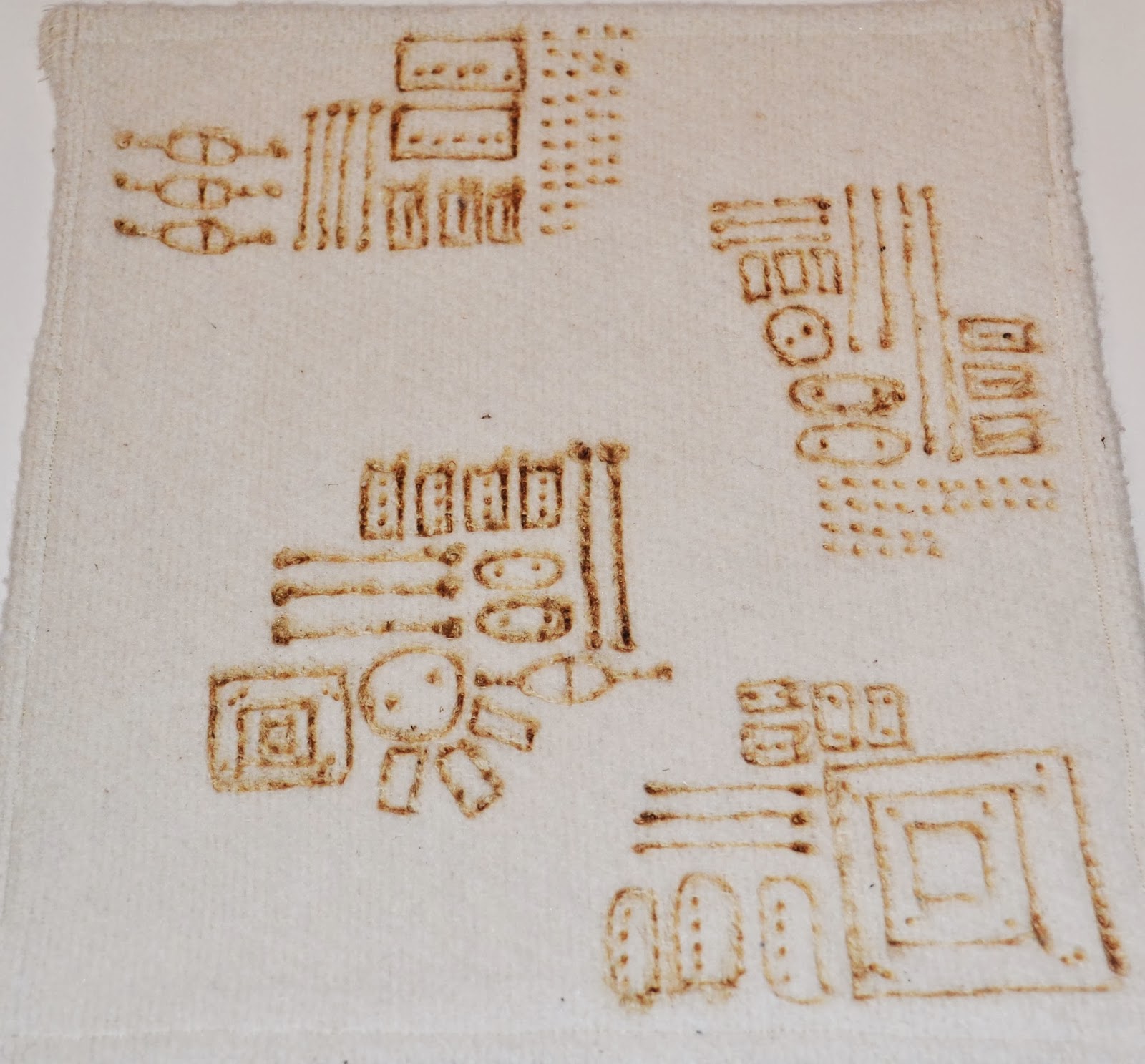
I think this technique worked really well. My soldering iron cut through most of the fabrics really well, the only one it didn't work with, that I tried, was Ice wool. I don't think it will cut through very will with natural fabrics, because it only burned the cotton I used.
I think that the real leather samples I tried worked the best, because it burned through and melted the suede, creating a shiny surface. I could see this as a subtle pattern on leather stationary, book covers, or even as a statement panel on a sofa.


Combining my components with the originals. I think this makes the piece look really interesting. it adds texture and makes the surface look unique