Evaluation

Time management was a weak point for me during the Practice unit, but by creating a plan and forming a time table at the beginning of Unit X, I have overcome this by keeping up to date with all my work and avoiding a rushed panic at the end.

My design research has been extremely useful throughout my practice as it has influenced the decisions I have made to complete my work to a professional level, resulting in my design knowledge involving finishes, embroidery and print techniques improving greatly. I have a better understanding of the Ethos, as I can now create a blending technique between threads. This was something I wished to achieve before I graduated.

By networking I feel that I have a better understanding of what direction I want to go when I graduate, as I see myself as a designer for interior surface patterns. It has made me consider how other people see my work, and how I should present myself in a professional way and show ownership of my work. Whilst volunteering at the Antiques Fair I enjoyed being able to speak to so many likeminded people with a passion for textiles so I have decided to join the textiles Society. 
My overall aim for this unit was to combine print and embroidery to create repeat patterns. I am happy with my designs so far as I feel they reflect the variety in design I was hoping to achieve. I feel that detail is important in my designs, and I have emphasised that by including detailed embroidery.

I feel that my designs strategy has become stronger as I now try and create many variations of the same design, which can result in a variety of designs that look completely different yet use the same motifs. I think it is important to include variations of the same design, including different colour ways as they may appropriate for different audiences, such as in Cole & Son’s Whimsical collection that features the same vertical plants in two different wallpapers.  

Crown Paint

I have decided to take part in a very open live brief by Crown Paint, which involves reinventing their colour fan deck and colour palette. I have decided to participate in this project with another student who specialises in print, as she would like to redesign the colour palette as I concentrate on the fan deck. We have decided to work together as we will cover both aspects of the brief.
I began by researching how other companies present colour. I found that a variety of companies dedicated a whole page in their fan deck to one colour. As this was something Crown had mentioned they were considering doing, I devised a solution where by a fan deck would be made for each collection.
 

I then realised that as the fan deck was intended for trade use, it may be possible that they would want to combine colours from the colour palettes provided to form their own, or one for a client. This meant that the colour cards need to be detachable to the fan. 
I undertook further research on different fastenings that could be used instead of the current screw and ordered a temporary one from Amazon, to make sure that my idea was viable. 


I have also suggested that extra pages are added to the fan deck, providing sections where the customer can keep their own colour palette at the back. I thought this would be useful for trade's people who are working with more than one company to keep their colour palettes separate without getting lost. 
Another page I am suggesting is one that includes the range of finishes provided by Crown, as some paints are available in matte, gloss and floor paint, I feel it is important for the customer to see the differences. 


I have enjoyed the crown paint project because I feel that I have made realistic changes to the fan deck that could be put into practice. We will be presenting our ideas on Wednesday 13th May, but have a practice run through on the previous Monday. Even though I don't feel that this project has directly influenced my current practice, I feel that it has improved my presentation skills. I want my ideas to be displayed at a professional level, whilst keeping them simple and easy to understand. 


Making it Building it: Craft Your Future

On Thursday 5th March I took part in an emerging makers day at the Whitworth Art Gallery called Making it Building it: Craft Your Future. It consisted of a series of talks by artists and designers explaining how their careers started. We were also able to network and I managed to speak to a few people about volunteering opportunities and possible jobs within Manchester. I have taken note of a couple of email addresses of people I was introduced to, and I plan on contacting them again in the near future.
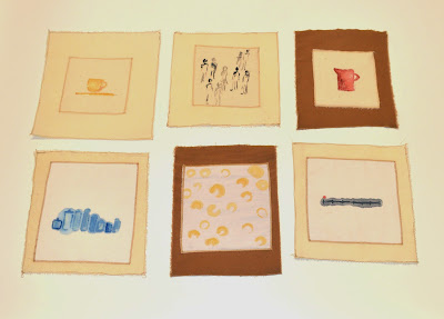
I was also asked to create a stitched response to the day, so I created a series of panels to represent certain aspects that stood out to me, these range from work shown during the artists talks to a cup of tea offered at the beginning.
I found the day to be a really positive experience as I was able to interact with a lot of makers, and people who took a keen interest in their final products. This has made me consider where myself and my work will fit in the industry. I have always enjoyed making, however as my photo shop and Ethos skills have improved I find myself more interested in design and sampling. I would consider working freelance, however when graduate my plan in to find a job within a fabric design company.

Stitched Response

It was after this I decided to create a professional online presents by making a website. I have displayed a range of my work with a small description about myself, however I intend to add more so that it is completely ready for when I visit New Designers in June. My web address is www.claireowens.co.uk  


Embroidery

As my intention has been to create a collection where embroidery is used to enhance the detail within print designs, I have gathered research on existing decorative embroidery for interiors.
I volunteered at the Textiles Society's Antiques fair and noted the different ways traditional embroidery was used to add tone. The image below is one that particularly interested me because tone is added through the use of a looser zigzag stitch over two closer together stitches. This technique will have been completed by hand, however I can create the same effect on the Ethos by using different stitch widths, below is my design using this technique.

Textiles Society Antiques Fair - Embroidered Silk 
My Tonal Design 

I have also taken into consideration current embroidery designers. Vaughan is a design company that create a range of embroidered fabrics intended for interior uses such as upholstery and curtains. One aspect of their designs I found interesting was the stitch width was very wide. This could be for a number of reasons, one being to save money by using less thread, and another being to avoid creating a raised surface on top of the fabric causing it to become unsuitable for upholstering furniture such as chairs, which are intended to be sat on. I found that opening my stitches out causes the least amount of change to the fabric and is therefore a technique I intend to use.

Vaughan Designs.com

Fabric

After visiting a fabric store in Manchester and not finding enough variety between repeatable fabric for an interiors collection I decided to visit Berwick Street in London to buy fabric suitable for my project.
I found the research carried out earlier in the project useful when making my decisions as I had noted the different fabrics used for present interior designs were usually thick, not stretchy and durable. I had also discovered that interfacing can be used to make a fabric thicker; Christopher Guy for example backed silk to make it more suitable for upholstery. This technique has widened the possibilities of fabrics I can use as I can make thin fabric thicker.

Christopher Guy Backed Silk Sample 

When selecting my fabric, I thought it best to keep to whites and creams as they are in my colour palette, but also easy to dye, but I still wanted my fabric to be durable so I taking into consideration the market research executed during the practice unit, where I researched a range of bedding, and the research carried out during this unit I selected a range of cottons, linens, and wool. I also came across bamboo fabric and have decided to test this in my collection because it appeared to be a thicker softer cotton. After researching it's qualities I found that it is extremely durable, soft and antibacterial, therefore I consider it suitable for an interiors collection.
I dyed a range of cottons and beige and purple by using the facilities in the print room. My fabric dying successful because the colours match my colour palette. I then bought some dye to use at home but not many of my samples were successful. This was because I used a washing machine dye which was distributed unevenly over the fabric. Because of this I have bought a range of pre dyed fabrics too. I plan to use this fabric to create a range of screen printed samples and some that only feature embroidered motifs because I want my collection to be varied by including complicated and simple designs.

Fabric Dye Experiments 

Designing

I have been undertaking composition research appropriate for interior fabric. I like the composition of Paolozzi's work, however I intend to be working in repeat so I have been analysing what I like about his work so I can reflect this into my designs. I have concluded that I like his use of random shapes, interlocking pattern and abstract scenes, which is also present in the Scandinavian styled work I had researched during the practice unit.

Doris Gregg, Welwyn Garden (1926)

A design I specifically liked the composition of was Welwyn Garden City by Doris Gregg (above) because it displays an abstract scene in a repeat. I wanted to recreate my own abstract scene in repeat and for my first attempt I decided to use my mountain scene inspired motifs because I wanted to include natural forms within my design in order to keep in line with my concept of Mechanical Nature. I have also included linear forms as well as cogs in the design to give the impression of a working machine. I'm happy with my design as I think the half drop repeat joins up well, making an interlocking repeat, however I feel that more depth can be added to the design through embroidery.
I have been trying to create designs with varied colour ways, as shown below, as I learned that this was important during my initial research at the Chelsea Harbour Design Centre.


I have also decided to create more than one collection, I feel this will enable me to create a varied range, however I was concerned about using the same imagery and motifs throughout. I have looked back through my research and discovered that Cole and Sons reuse designs and ideas within different collections. For example their 'Woods' design is displayed in their Contemporary II collection, which features bold, large scale designs with contemporary colouring, but has also been reworked as another design called 'Woods & Stars' in their Whimsical collection, which features a nostalgic range of designs inspired by a fairytale theme. I feel that this works because the collections are portraying a different vibe, which has made me consider what atmosphere I want to display through my collections.


Drawing

During the Practice unit I experimented with using a range of drawing media including a Chinese brush to create bold motifs, however because I plan to create more tonal designs I have decided to use pencil and charcoal as I find it easier to control shading. After taking photos from the Natural History Museum I created drawings that focus on translating texture and shape in a direct way.
I felt that during the practice unit my motifs could have been more varied if I had practised different drawing styles, so I created a series of motifs by watching an Moving Art: Forests by Louie Schwartzberg as he films his journey to the Redwood coast (California, US) and Olympic National park (Washington US). The compilation is a display of forests, meandering rivers and interesting landscapes. I found myself working at a fast pace to translate what I saw before the scene changed, making my drawings freer. I feel that these abstract drawings will contrast to my detailed motifs, and create more variation within my work.

Fast Paced Motifs                 Detailed Motifs


Colour

During the practice unit I spent a lot of time choosing my colour palette from a selection of graffiti images. I chose these sources because the colours were bright, bold and fun and therefore appropriate to my theme. Due to the unit being shorter, I don't have as much time to experiment with colour, however I understand I want a colour palette with a natural vibe to reflect my theme of Nature Vs Machine.
I decided to experiment with colour by dying fabric with vegetables and plants; onion, red cabbage and dandelion leaves gave the best colour, whilst beetroot was surprisingly temperamental due to it not taking to the fabric.
I found that the colour translated was very tonal, which is something I thought my colour palette during the practice unit was lacking.
I scanned the samples into Photoshop, where I used the colour pick tool to select the colour, creating my colour palette.

Vegetable Dyes

Colour Palette 


Research for Unit X

During the practice unit I focused on translating imagery collected over my summer travels on to fabric through patterns aimed at interiors. I worked with a wide variety of imagery but I didn't focus enough time developing my drawing technique, instead I created a number of motifs in similar styles causing me to overcompensate by creating complicated designs. I also found that because I was working from a wide range of imagery with no consistency I found it difficult to keep my designs fluent.

Taking this into consideration I have decided for Unit X to investigate a nature Vs machine concept as I feel that this will keep my initial imagery and designs fluent, creating a refined interiors collection.
I will focus on only collecting imagery that features a natural (plants, rocks, shells, landscapes etc.) or mechanical form and I have started by collecting photographs from the Museum of Science and Industry and the Natural History Museum.

Another aspect I felt needed more focus was artist/designer research. Collecting this type of research is important when understanding where my work will be in the market, and bettering my understanding of high end interiors. I have recently visited the Chelsea Harbour Design Centre to gather research regarding current high end designs. I liked the contemporary wallpaper designed by Cole & Son because it creates an environment by displaying scenes of rough seas, marine life and forests in repeat. It was useful to see how the different colour ways could vary for a design, and demonstrate a subtle or dramatic vibe. As some of the designs were produced in up to five colour ways, I feel that this variation is important when targeting different audiences. When designing I will need to consider what vibe I want to demonstrate throughout my designs, and make sure it is suitable for my target audience.
I also found it interesting how a motif can be reused, for example the leaves featured in their design Secret Garden are also present in the underwater scene Nautilus. The subtle reusing of motifs in other designs can save time whilst creating fluency with in the collection.


Brunschwig & Fils was another company that interested me, as their designs feature a vintage/ retro theme. It appears that the drawing style differs greatly within a collection. Below are four deigns from the Le Jardin Chinois collection, inspired by the West's artistic fascination with the Chinese lifestyle, this collection celebrates the fantasy and timelessness of Chinoiserie. Each design is displayed in a number of colour ways, and easy motif and imagery differs from each design. The idea of stripes or florals is present, however each design is completely different. I found that the only similarity between the designs in this collection is the colour palette, which sticks to red, blue, green, yellow and brown with some white. It's interesting to see the difference in design techniques between Brunschwig & Fils and Cole and Son, however it could be possible that as one is a wallpaper company their aim is to create fluency within a home, whilst a fabric collection creates differences in the rooms.


I have started to research different mark making techniques and drawing styles and I found that when it comes to composition I am drawn to collections of motifs. This is something I have reflected throughout other projects and is something I wish to revisit as I feel it is appropriate for this project. I have mostly been inspired by Eduardo Paolozzi's machine prints. The fluidity in his work appeals to me as it reflects the moving parts of a machine. This is something I aim to reflect within my own work, however I wish to also combine imagery from natural forms. I feel that the complexity of the prints would work well in repeat, as the contrast between the straight edges and curves give the impression of movement.


evaluation / reflection


Creating motifs from a wide range of imagery was useful, but my inability to be more experimental at the motif development stage held me back later in the project. I should have allocated time to undertake drawing tasks in order to create more variations of an image, giving me more motifs to select from. I found that having a range of different styles of motif allowed me to work more freely with layering and my focus for unit X will be on variety rather than quantity.

The fast development of my motifs will enable me to experiment on the ETHOS sooner and avoid struggling to get a place on the machine again. I also think that planning my time used on the machine precisely worked really well for me, so whenever I am on the machine, I will make a plan and decide colours and placement beforehand.

I found that one of the most successful ways of working was directly in context. This helped me to stay focus and enabled me to experiment with scale and colour more easily, allowing me to utilize my time more efficiently. I found that working on photo shop at real scale on a PC very difficult and time consuming compared to working on a Mac. This isn't a problem I have encountered before, having never working on a large scale. My computer skills have improved greatly. Reading Lotta Kuhlhorn's print design book was extremely useful because it taught me how to arrange a variety of repeat patterns. It also gave me inspiration for how to develop designs further.

Completing context and composition research throughout my project was very useful because it kept me focused on creating two collections for different age groups. I think that it would have been more useful for me to be constantly researching print and embroidery artists throughout the project too, as this would have given me more inspiration from which I could interpret unique designs. I feel that this would have allowed me to work more freely because although it is important for me to work with in a context, it is also important to create unique designs and develop ideas on my own.

I felt that the repeat pattern I created on the ETHOS worked well and I intend to develop this further. I believe that heavy embroidered patterns can be used as boarders or areas of focus within a design. Stitching out a large pattern can be time consuming, emphasising the importance of working quickly and effectively at the development stages of the project. Working in context helped me to foresee a potential embroidery design used for an interiors purpose.

Overall, I am happy with my use of colour for my designs. I think that I have created a good variation and have incorporated embroidery where appropriate. Throughout this course I have found it hard to place my work in context because my lack of understanding of my target audience. I feel that by completing the research throughout this project has enabled me to understand how a design can be fun and aimed at adults. I have learned that when designing I am easily distracted but by having target audience research present, it stops me from going off track. I look forward to applying my new working strategy to unit X. 

I feel that my collection for adults was more successful than my collection for children, due to the inclusion of embroidery. Even though embroidery is present in the market research I'd undertaken for children, it is more commonly used for adults. This has lead me to the conclusion that in order to develop my embroidery further during Unit X then my target market will be more suited to adults. 


more print designs and ETHOS

I created a range of repeat designs with the intention of adding more detail with the ETHOS. This should have been completed sooner and by being cautious with fabric and experimenting on screen prints, I feel conscious about my time management. Although researching the different effects that the ETHOS has on the fabric was necessary and has influenced my decisions when choosing digitally printed fabric, I am aware that the selection of fabrics in the print room are limited so during Unit X, I intend to source my own.
I like the idea of including stitch in a repeat pattern. I think my samples have been very successful because the stitching has matched well to the print design. I found it easy to do this by marking down where the centre of the design was on the computer (just after designing) so that I could line it up when on the stitch out machine. I also used filmoplast instead of stitch and tear, to ensure my design was straight.
 
Embroidery over repeat print

I also used the ETHOS to create a 20 x 20 cm repeat tile. I am pleased with the outcome, as the edges line up perfectly and I intend to develop this idea further. I will have to consider time management more carefully as the stitch out machine gets booked up quite quickly nearer the end of the project. I intend to overcome this during Unit X buy completing my design development at a faster pace.
This type of dense embroidery could be used as boarders or an area of focus within a design. During Unit X I plan on developing the repeat technique further by creating a range of designs consisting of different densities of embroidery.


ETHOS


I experiment with the ETHOS on to screen printed designs. I thought that this would be a good idea in order to experiment with placement, fabrics and colour. I only used two screens (one a negative of the other) to create backgrounds because I didn't intend screen printing to be a major part of my project because my aim is to be commercial. I didn't expect the screen printing to be as successful as it turned out to be and part of me wishes I'd developed this further by making more versatile screens.

In regards to fabric, the cotton poplin was the only one that caused an. Being thin and having a papery texture means the multi-head pierces noticeably large holes through it. The tension is also odd, as my bike motifs seemed to pucker and buckle whilst stitching out the wheels due to the circular motion and the problem didn't occur on the other fabrics. I have created another bike motif so the problem doesn't reoccur but I will avoid cotton poplin during Unit X. I have been repetitive when experimenting at this stage. My time would have been better focused on developing digitally printed designs. I will take this into consideration during Unit X.


repeat and design variations


This design displays the versatility of scale I wish to achieve. I have also developed it into a repeat pattern that can be used in addition to bedding. After I completed this design, I was happy with the variety of motifs and the overlapping presentation. I then went onto to creating other variations that can be used for adults instead. I aim to use this technique of changing back and forth through the age groups as I feel it allows me to be more productive than just focusing on one group. I enjoy experimenting with a design to see how much it can be changed through different processes, I feel that it is important to push each design as much as possible in order to have a wide range of designs. 


developing designs in context

Here I put into practice the idea of designing in context (bedding).I found this method worked well because it kept me focused on my overall aim and I intend to reuse it during my development in Unit X. What I found interesting was creating a single and a double duvet set with the same design, as during my market research I found that it was common to find designs ranging from single to king size.
It wasn't a surprise that Children's bedding was commonly presented on single beds, so when designing I took this into consideration and designed single bed sets for children and doubles for adults in order to maintain focus and therefore productivity.
 
I found that many of the motifs featured on the designs I'd seen varied in scale, and a few had been used across a variety of different interior products. I found that Orla Kiely's work kept occurring in the research I have been undertaking (from Marimekko to John lewis). I thought that her work achieved similarities to what I am aiming for as the size of the motifs she uses varies throughout the different products.


composition research


It was suggested that I undertake more research on composition. I started by looking at Marimekko and Scandinavian designs and after a trip to the library I feel a lot more confident in what I wish to achieve.  I am finding it difficult to create fun designs for adults, as some appear more suited to children. This relates back to my previous research of putting things in context. Sally suggested creating thumbnail designs in order to create ideas on paper first before going onto photo shop. This strategy was helpful and I plan to repeat in Unit X. I found it easier to use small pieces of paper printed out with a background design of my own. This was because it kept my colour palette in mind. I also liked this idea because it meant that I didn't have to be around a computer to develop my designs.
Examples of Research


Marimekko
Soviet Design

Consider:
Scale
Colours
Repetition
Direction of pattern

Lotta Kuhlhorn


I came across Lotta Kuhlhorn's book Designing Patterns. What was so useful about it was the compositions she presented were what I was looking to achieve. She also had instructions on how to create similar patterns on photo shop. Having never practised repeat patterns before, this was a great find. I also found similarities in colour and motif designs that I am looking to achieve.


initial designing

During my initial designs, I focused on the arrangement of my motifs. I have been concentrating on creating a wide variety of motifs and some consist of a few variations. I feel that I'm not being as free as I should be because I'm too focused on making decisions on composition. I also felt that I had too many colours in my colour palette so I have refined it, as some of them weren't contributing to the overall feel I wished to achieve.

I also encountered a problem with my motifs; Because I have crated them on my own laptop, it appears that a few of them have been defined with a shaded background. This isn't visible on my own computer but is in the ones in the art school (because the screens are better). This has made me loose time I was trying to save by creating my motifs at home, however I can resolve them by using illustrator and the image trace setting. As annoying as this is, I'm glad I noticed the problem early in the project. I have also taken this as an opportunity to refine my motifs. I thought that by having a lot it would make designing easier, however now I think it's actually harder; they don't tend to appear consistent in my designs as I though a few would overlap throughout. On the other hand, if I was working freelance then my motifs couldn't reoccur in different designs.
I have concentrated on creating a very direct translation of the images I am working from, but in my group project I found it a lot easier to be more experimental with my designs. This had led me to the conclusion that during Unit X I will create motifs that can consist of a more tonal range because I enjoyed working with the shaded/ textured motifs in the group project.


context research

I found it useful researching children's and adults interiors at the same time. I had considered splitting my project into two parts, designing for adults then children, however this seemed inefficient and repetitive. I started to notice that some of the colours reoccurred across the age groups such as yellow and blue, which were present in girls, boys and adult designs. I also feel the context the designs are presented in makes a big difference to the overall appearance, making me think that the same design could be used for adults and children. Because I want to include embroidery in my work, I am concentrating on researching the High-end market.
 
Harlequin research 


I feel that this research has bettered my understanding of what I wish to achieve. It is important to remember that when designing for adults it should appear fun, not childish. When taken out of context, many of the designs appear to suit a range of age groups. An example being the pink bedding; this is designed for adults, however, if presented on a single bed then it would appear for a girl’s room.


Patternity Project

I decided to enter the Patternity project because the brief was to enter photographs of the everyday that displayed patterns. The winning images would be displayed in an exploration of pattern look book. I felt that this coincided with the work I had completed over the summer because I was looking for patterns in everyday forms, some of which included nature. Below are the images I entered in the competition. I took into consideration the different qualities each image offered, including the use of shape, colour, texture and symmetry. I felt that each could be used as a repeat, and they are all images that have inspired my own project.


Collaborative Project


I thought that it was be a positive and informative decision to take part in a live brief with fellow students. The group was evenly matched with two embroidery/ print students (including myself) and two sole print students. I found it useful to see the different ways people worked. I found this process to be more positive than other group projects I had taken part in before because we all wanted the same outcome.


After researching possible competitions, we decided to enter Feather's Make Wallpaper that's Art competition and decided to focus on a beach / seaside theme. We also decided to work from the same colour palette so that out designs could be seen as a collection at the end.
I decided to base the idea for my designs on David Attenborough's The Blue Planet documentary because I hadn't completed any previous research regarding the sea to work from. I decided that I would focus on my illustrative style of drawing, in order to incorporate a skill from my current project. Below are the collection of motifs I developed through the images of marine life displayed during a range of programs throughout the series. Most are derived from jellyfish and shells.


I found it interesting to work in repeat as this is what I am practising in my own project, having never done it before I found this a useful skill to acquire.
I enjoyed the fast pace of this project the most, because there were four of us in the group everything progressed faster than an individual project. I also enjoyed working will people who wanted to work and overall found this to be a positive process. I feel that this process has confirmed that I prefer working in collaboration with others. We kept up to date with each other via email so our work could still progress even when we weren’t together.
My designs incorporated an illustrative effect and using motifs made by other members of the group enabled me to feel more free. I liked working in repeat, and I will apply this to my work during the Practice Unit.


I submitted three designs to feathr.com. Each of them displayed all over patterns, resembling a landscape effect we had discussed at one of the group meetings. I felt that the designs were the most commercial and fulfilled the brief by suitable for statement wallpaper, intended to be seen as art instead of decoration.
Under the Sea 1


Colour Palette


I liked the use of colour in the graffiti I'd seen because it was fun and quirky. I used Photoshop to extract the colours from a range of photos I had taken, but I want the overall feel of my collection to be fresh, with one or two warm, bright colours, reflecting the colour combinations I'd seen in my context research. I thought it was important to experiment with a few combinations because these designs weren't intended to be presented for interiors. One of my fears of choosing a colour palette from graffiti was that they could make a room feel enclosed because they incorporate so many bright colours; however on closer inspection a lot of the colour ranges appear suitable for my project. I also kept in mind other patterns that I'd seen and liked, noticing that I don't want too many colours in my colour palette. I want my colour palette to be gender neutral so that I can experiment with designing for boys and girls as well as adults. I found it useful to create mini colour palettes, as it made it easy to see contrasting colours and compare against my research.

Photos and Motifs


Below are images I wish to change into motifs. I have grouped my photos in two: patterns and motifs. Many of the patterned images consist of brick walls and I like the idea of incorporating them via the interlinking brick pieces, however I'm not too sure at this stage how I will develop this further.
I have already started recreating them with an illustrative technique researched last week, along with experimenting with different thickness of line; however, I'm not finding any of the designs particularly exciting. A few suggestions were made during my tutorial that I am excited to try out, such as looking at abstract artists and to experiment with using a Chinese brush for a different effect. Chinese brushes are used to create the description of a shape with a single line and I think that this will add more character to my work. One artist suggested that I look at was Michaux, who is an artist/writer that creates abstract alphabet drawings. I thought these were particularly interesting when experimenting with the style of a line. 

What I have learned through developing my work through the process of drawing is that the hand drawn effect really appeals to me. When visiting New Designers, I came across a few techniques that really inspired me, one of which was a series of patterns that appeared to be graphite or charcoal drawings printed on fabric. I thought that style of drawing had an interesting effect because it made the fabric look like paper and added more depth to the piece. The design had a really crisp finish, with defined edges, so in order to create an effect like this I will have to undertake fabric research sooner rather than later. 

Images for Motif Designs

research on abstract work and Chinese drawings

Boards includes
(from left to right) 
Graffiti on The Duke of Lancaster (the fun ship, Wales) 
Michaux alphabet
Rene Magritte 
Other Chinese paintings 

Live Brief: Alice Kettle

Throughout the year, a fellow student and I have been participating in a project with Alice Kettle, both commission based and collaborative. Alice Kettle was asked to create a large-scale textiles piece in order to portray the company Lloyd's Register. They plan to display the work in their new offices as they are relocating from Central London to Southampton. We visited the original site last year in order to collect visual research and have created fabric samples from this. I feel that this opportunity is beneficial because it enables me to work with a successful artist in order to create art intended for an interiors setting, to work in an external setting and to learn new skills concerning print and embroidery.