I took these designs from my original collections of motifs that I made by using illustrator on photoshop. I'm really excited to see how these turn out on fabric. I'm not too worried about needing any more patterns because they can be duplicated and combined together anyway.
Sonia Delauney
..created interesting geometric prints by using bold colours. They have a cartoon like appearance to me because they look like the shapes are outlined, which is a really interesting use of negative space. In think that the fabric she has printed on dyes really well. I've seen some of the fabric in the digital print room and some of the colours run quite easily and obviously.
I think that the swimming vest looks really interesting. the pattern looks like its been embellished onto the vest. I also think that the colours used in her pieces are quite similar to my own.
Edwardo Paolozzi
This artist creates really interesting screen prints by using bright, bold colours and geometric shapes that make up a mechanical like appearance.These prints look like they make up a working electrical structure, and I think that the style is very interesting because the images have a fun, child-like quality to them. I think that in my own work it is important to keep my colours bold, and I am now really confident with my colour pallet.
What I have noticed about Edwardo Paolozzi's work is that he uses a lot of overlapping of images, I think that this works really well in his pieces because they vary a lot in size.
digital prints
I created some interesting digital prints om photoshop. I found that I could duplicate the same print, and change the colours to get different effects. I then chose the ones that I thought were more successful to be digitally printed onto fabric.
I did two lots of digital prints, my first set was on cotton popilon, which I didnt think was very successful. The fabric felt like a cheap white cotton work shirt, and the prints came out slightly scewed. The patterns that I'd chosen to be printed weren't bery successful either, and I ended up combining them with some other samples and using them as a background, so they weren't a complete waste.
For my second time round I decided to go back to photoshop and create some different prints, by using my motifs, as opposed to my photographs. I chose a thick dense fabric for the prints to be transfered onto called cotton canvas. It feels like a strong, durable fabric, and it also holds the dye really well. I'm really happy with these set of prints
motif development
I used illustrator to develop my motifs by motifs.
I really liked the back of the circuit boards from my TV, so I decided to use them as my main source of inspiration.
I then coppied and pasted each object into photoshop, where I turned them all into brushes
I then created larger motifs out of clusters of the smaller components to make it easier to develop my patterns
Charlotte Smith technique
Charlotte smith uses drops of acrylic paints to create raised surfaces, essentially out of colour.
I found some paint that I've had for a really long time, and its used to create window stickers. When it dries, it creates a raised surface, and it also dries shiny, which I thought linked to the shininess of the glass from the TV.
It's a different technique I wanted to try. It feels really strange to touch, once its dried on paper.
I also had a go at recreating some photos out of the paint, to experiment with colour and shine.
I would like to use this paint more, because its so different. I think I like it because it's shiny, textured and colourful.
I found some paint that I've had for a really long time, and its used to create window stickers. When it dries, it creates a raised surface, and it also dries shiny, which I thought linked to the shininess of the glass from the TV.
It's a different technique I wanted to try. It feels really strange to touch, once its dried on paper.
I also had a go at recreating some photos out of the paint, to experiment with colour and shine.
I would like to use this paint more, because its so different. I think I like it because it's shiny, textured and colourful.
Working with Glass
I decided to break the screen down, to make the TV easier to move because it was so heavy, and I wasn't planning on doing anything with the glass, but instead of throwing it away, I decided to combine it with my work.
Hand made paper
I made a few sheets of recycled paper ages ago, and I thought I would put it to some use, but I don't think this worked very well because the paper was textured, it made it really hard for the glass to stick to.
White paper
All the pictures I took made the glass look purple, which I think looks really interesting. I think it must have been the light at the time.
Printing with Glass
This created some interesting shapes and because I printed with the class on stitch an interfacing fabric, that is a bit transparent, you can layer the pieces up to create different patterns.
a lot of the glass was quite thick, so when you looked through it, it would distort whatever you were looking at. I thought this was really interesting, so I started to play around with the glass a bit more by using it to distort colour. I thought this would be a good way to be a bit experimental, as in my last tutorial Fiona had spoken about a project she'd overseen, where students would have a piece of fabric, and they had to manipulate it in different ways. I thought I could try something similar with the glass, to see what I could achieve....
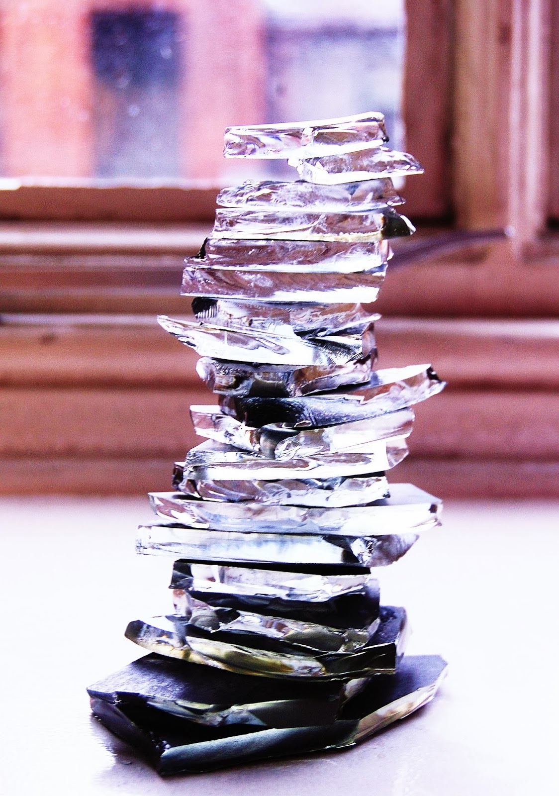
I layered up the glass and fixed the pieces together with glue. I think this piece looks really interesting, because it distorts the appearance of whatever's behind it. I think this would be a good piece to experiment with on photoshop.
Painting on glass
I didn't actually think that the paint would stick to pieces of glass, but I think it created an interesting technique because the paint takes the shine away from the glass, and gives it a matt surface.
Painting under glass
This was really interesting because you can still see the colour under the glass, but the glass gives the paint a textured surface.
Different Papers
I presented the glass in a range of different forms, and by using different sized pieces, in order to experiment with shape and pattern.
Black Card
I really liked this effect because the glass looks white, which contrasts well against card.
Hand made paper
I made a few sheets of recycled paper ages ago, and I thought I would put it to some use, but I don't think this worked very well because the paper was textured, it made it really hard for the glass to stick to.
White paper
All the pictures I took made the glass look purple, which I think looks really interesting. I think it must have been the light at the time.
Wallpaper
I had a sample sized piece of black, glittery wall paper, and I think that the glass contrasts really well against it. The small pieces of glass blend in well with the glitter, and the glitter ads a bit of colour.
Printing with Glass
This created some interesting shapes and because I printed with the class on stitch an interfacing fabric, that is a bit transparent, you can layer the pieces up to create different patterns.
Subscribe to:
Posts (Atom)